
What 5 Democratic Candidates' Websites & CTA Overload Can Tell You
In today’s news cycle, it’s hard to miss that there are currently 24 candidates trying to clinch the Democratic party’s nomination for the 2020 election. To be honest, it’s a bit overwhelming, especially when you consider how fast the news cycle moves, and there are 24 candidates.
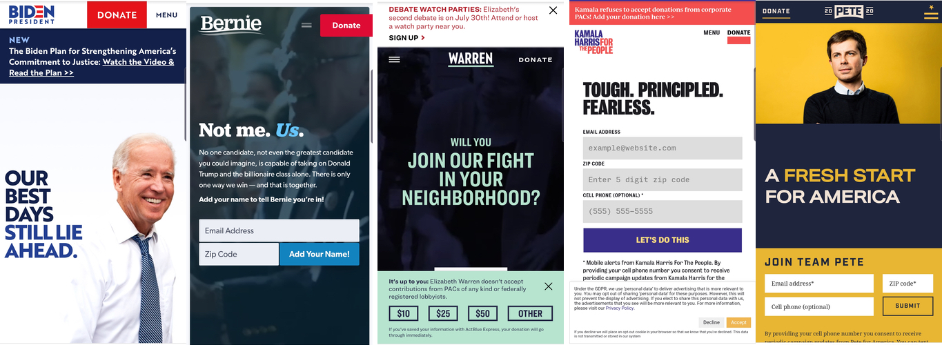
I found myself scrolling through a few choice candidates’ websites on my phone, trying to inform myself where each candidate stands on certain issues. At that point, I realized that I’m only going to vote for a candidate that has a well-designed, useful website because I think it’s important to know how to reach people online nowadays. Sure, you can have a Twitter account and just tweet at everyone angrily with spelling and grammatical mistakes (covfefe!), but I want more than just 280 characters and a thread. Aside from a website’s content, the design and usability can also be very telling.
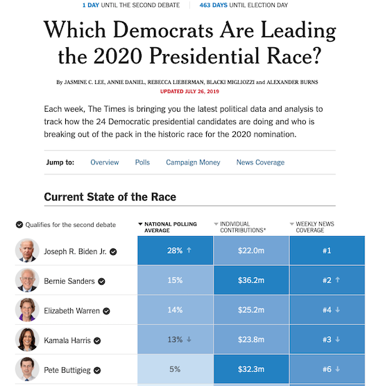
I don’t really have the time and patience to look through 24 candidates’ websites, so I’ve narrowed it to the top five who are currently leading the polls according to the NY Times and Rolling Stone. Because the polling is updated weekly, here is a screenshot of what the standings look like as of 26 July:
It is intentional that I don’t write about politics frequently; in fact, the last time I really wrote about politics was after the 2008 election and when I went to visit the Landstuhl Medical Center back in 2009 with other Americans. I don’t claim to be any political expert by any means, but I felt like this was a different way of approaching the current politics in a way that doesn’t make me want to run for the hills screaming.
A short disclaimer: I am a registered Democrat and actually vote in every primary and election, even from abroad. Additionally, I’m only actually looking at the websites on my phone because the mobile share of total digital minutes in the US in 2017 was 65%. Considering that that statistic is already two years old, it is bound to have gone up since, which means the majority of users are getting their information on their mobile device—so, mobile first (and for this article, mobile only).
The Use Case
I’ve looked at the top five frontrunners’ websites and have taken a closer look at things like searchability (e.g. how easy is it to find on Google), navigation (e.g. how easy is it to get around the website and find the things I’m looking for), and design (e.g. color schemes, font types, use of space). I haven’t cleared my browser cache because I’m looking at it from a regular citizen’s point of view, so my search results may differ from what other people are seeing. When I talk about how high a campaign site is ranked, I’m only counting websites and excluding the other widgets that Google inserts like top news and videos.
Let’s start at the top.
The Standard Political Website:
Joseph R. Biden, Jr.
On July 12 (the day I decided to write this article), I googled “Joe Biden” and clicked on the top hit that looked like it could be the campaign website. It took me a few minutes of reading to realize that something was amiss and I remembered reading in the news that there was a trolling website posing as the official one. (Side note: I am not posting the link or mentioning it specifically because I don’t want it to get more backlinks.) The fact that I was googling Joe Biden’s website two weeks after the article had made headlines and the SEO ranking issue still hadn’t been solved threw me into a fit of rage. I have a degree in media studies and it took me several minutes to figure out that the website didn’t seem right; I can only imagine how many people really were tricked into thinking it was the official one.
The crazy thing is if you google “Joe Biden 2020,” that trolling website is still the top hit and ranked higher than Biden’s official campaign website. In fact, the official site is actually the last hit on the first page for me. Granted if you check Google Trends, the search volume is clearly higher for just “Joe Biden.” But honestly—do you really want to have the top hit for “Joe Biden 2020” lead to a trolling website?
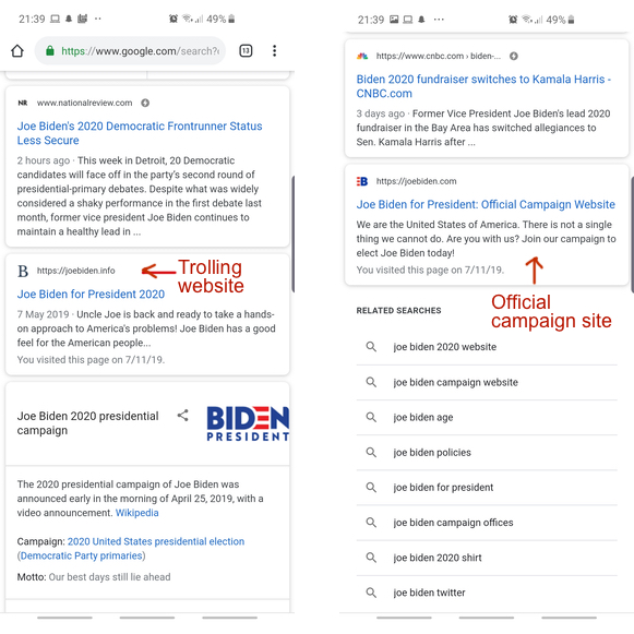
This shows me that Biden’s team is not handling disinformation well. If he and his team cannot handle it in the primaries, how should we expect them to deal with it in the general election? It is an established fact that Russia is still meddling in American elections. This trolling website is even from a domestic culprit. I don’t expect Joe Biden himself to know how to improve his SEO rankings, but I do expect him to surround himself with experts.
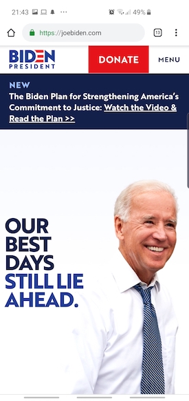
When I finally got to his official website, my first impression was, “It’s okay.” The colors are a typical, unoriginal scheme: red, white, and blue. I found it a bit weird that when I clicked on the menu, the “Donate” button is still red and there isn’t any real indication that I clicked on “Menu,” though the background became a light blue. I wasn’t sure if this was intended or if it’s like clicking on a link and everything else is accidentally highlighted. I found the center-aligned text on his homepage especially annoying because your eyes don’t know where to go, so it takes a lot longer to read. Lastly, I found it difficult to find where his policy ideas are; they’re buried on the “Joe’s Vision” page when you scroll to the bottom of the page and tap open “We’ve got to rebuild the backbone of the country: The Middle Class.” But by then, I was just so annoyed that I couldn’t find the information I was looking for that I said left the site.
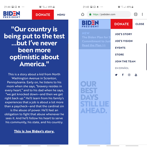
The Verdict: Finding Joe Biden’s website was a major issue and that already turned me off from looking at his actual website. The website itself serves its purpose, but it is hard to find the actual policy issues. Unfortunately, I get the feeling that he’s just depending on the fact that he was vice-president and is the best known candidate. We’ll see if that cuts it in the primaries.
Simple Yet Effective:
Bernie Sanders
Googling Bernie Sanders, I saw that his website is the third hit after his Wikipedia entry and Twitter account. That’s fine. When I landed on his site, the contrast to Joe Biden’s site is really stark. There’s a video playing in the background, the text is left aligned, and white space is used well. Signing up to their mailing list is the most important CTA besides the donate button; Biden’s website had some popover that didn’t appear consistently and I couldn’t tell when it would appear or not. Bernie’s website does a much better job here; they’re just asking you for your email first and will bombard you with information later. The only similarity is that Bernie’s site is also red, white, and blue but it uses blue hues instead of only the three colors so that it is less obvious using a patriotic palette.
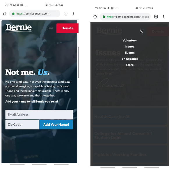
I really liked the menu on Bernie’s website—it’s clear, concise, and I knew exactly what to click on to get the information I wanted. When I navigated to issues, I saw that it’s a piece of cake to find what I was looking for. There’s an elevator pitch with Bernie’s signature, and it kind of made me laugh because it’s sort of like having an email with an image of someone’s signature; everyone knows it’s not real, but it’s trying to be authentic.
The issues on the page are concisely labeled in a blue field/button. There’s no mistaking anything for something else and I didn’t have to dig around. Clicking through the various issues, each issue also has a short summary on top why Bernie thinks the issue is important. You can just imagine Bernie yelling these things at you.
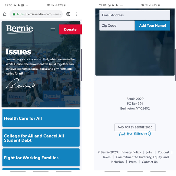
One little touch I noticed was at the footer: it says “Paid for by Bernie 2020” and then as if handwritten in, “(not the billionaires).” Like the signature, it might be a little cheesy, but as the “not the billionaires” statement is Bernie’s thing, it fits well into who he is.
The Verdict: Bernie’s website feels a lot more modern than Joe Biden’s. It’s very direct and gets to the point, and it’s clear that the people behind Bernie’s website are more in touch with current tech trends. Usability is super easy and I knew how to get the information I needed quickly. It’s simple, yet elegant and gets the job done.
Call-to-Action Overload:
Elizabeth Warren
Googling candidates and finding their websites was an adventure. With Elizabeth Warren, when searching on my phone, her website was the second hit after her Wikipedia entry. I immediately saw that her website has a slash in it, and all I could see was “/pocah,” which had me immediately confused and thinking it could be another troll. Instead, I was led to this page, which is from her official campaign, and it tells how the domain owner of Pocahontas.com redirected their site to the campaign website (I was half right that it had to do with trolling. For non-US people that aren’t familiar with why this would happen, our idiot-in-chief nicknamed Warren “Pocahontas” after some controversy that she claimed to have Native American heritage). The page urges the domain owner to redirect to the National Indigenous Women’s Resource Center instead and goes on to detail the real story of Pocahontas, explaining that “violence continues to devastate Native communities.” It’s informative and a great way of dealing with the troll; I checked and the domain does indeed redirect to Warren’s website.
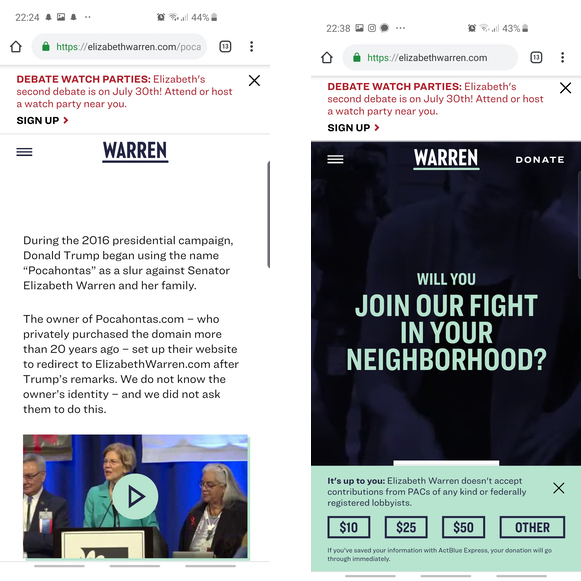
Navigating to her homepage, a popover immediately asked me if I want to donate. No, thank you, I am just looking for information, and your popover is really annoying. I can only wonder what the effectiveness of that is, but then again, I don’t think the majority of people seeking out candidate websites are comparing them like I am. After closing the popover, there’s an annoying sticky banner on the bottom asking if I want to donate. NO. I clicked the popover away, do I really want to have this annoying banner there?! I get it, candidates need to raise money to stay in the race, but I am just looking for some information! In addition to the annoying sticky bottom banner, there’s another banner at the top of the page urging me to attend or host a watch party for the debate. When I clicked on it, it led to a page which led to another page where I could sign up to volunteer. I was seriously wondering at this point what’s more important for her campaign—volunteering or raising money? These banners are irritating, though luckily only the bottom one is sticky.
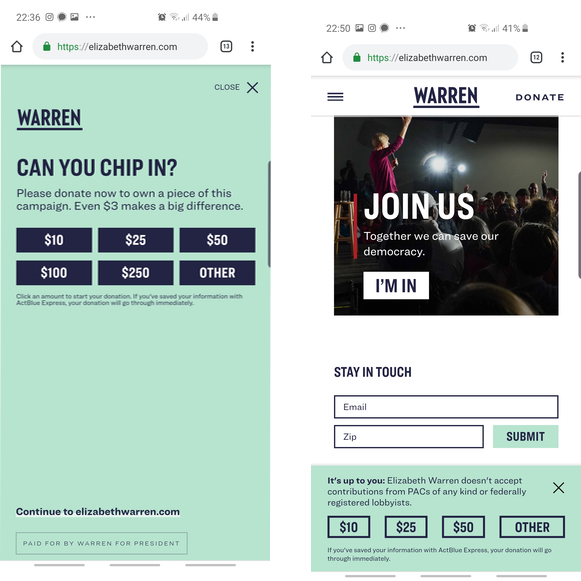
In addition to these two CTA banners, when you scroll down the home page a little bit, there’s a carousel of inspiring text that then lands on “Will you join our fight in your neighborhood?” with the button “I’m all in” and the other option, “I’m not sure yet.” OK, seriously, three CTAs on the homepage and nothing else but a video in the background like Bernie. Scrolling down the homepage and there’s more actions for you to take: sign up for the email list, RSVP for events, find events near you, another “Join us” and “I’m in” CTA, and finally, another email list sign up CTA. I counted a total of seven CTAs on the homepage, and that’s not also counting the “Donate” button at the top right which is sticky with the rest of the top navigation.
When I navigated to the hamburger menu, I liked the big, bold font, the color scheme, and the clear menu item names. However, good Lord, there’s yet another CTA to donate money built directly into the navigation menu. I get it, you want me to donate my money or time. I used to joke at my last job about integrating more pop-ups and more popovers for user retention, but Warren’s website is giving me a run for my money.
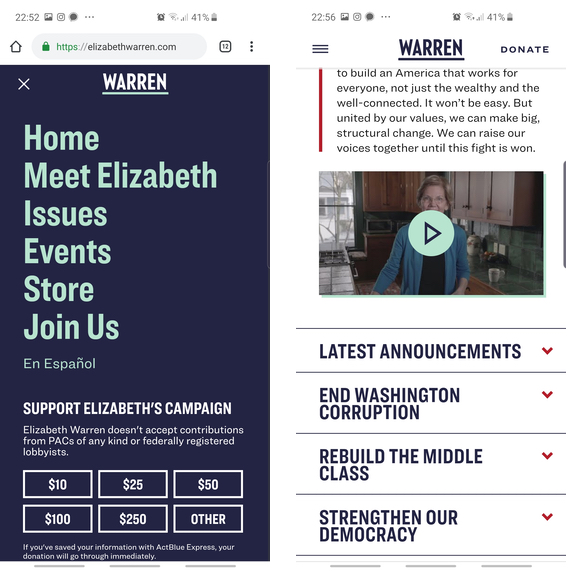
Clicking on “Issues,” there’s also a short summary at the top with a video featuring Warren herself (I didn’t click; I don’t watch videos, I’m more of a reader). The issues are divided up into what seems like a bunch of buzzwords in today’s political climate; “End Washington Corruption” and “Strengthen Our Democracy” are two examples. You can tap on them to read an explanation on what the problem is and what Warren’s solutions are. For me, they’re surprisingly not very detailed considering that she’s known for having a plan for everything, including fixing a comedienne’s love life.
The Verdict: I generally liked the style of Elizabeth Warren’s website with the bold sans serif fonts and navigation is pretty straightforward. But the huge minus point is the amount of CTAs; a sticky bottom banner with a sticky top navigation that has a donate button. I get it, it’s a campaign and the main goal at this point is to fundraise enough money to stay in the game. But I just wanted some information and I didn’t want to click on any of these CTAs.
Showing Some Personality:
Kamala Harris
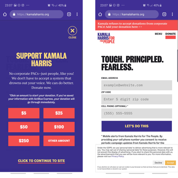
Kamala Harris’ campaign website was ranked fifth for me when I searched for it, after her Wikipedia entry, Twitter account, and articles from Business Insider and the Wall Street Journal. When I searched in incognito, it’s ranked third after Wikipedia and Twitter. Similar to Elizabeth Warren’s site, I encountered a popover immediately asking me to donate. As with all the other websites, I clicked on close. Interestingly, the popover didn’t appear when I navigated to Google and back to the website (it seemed Warren’s website had the popover every time). Harris’ homepage also has several CTAs: a sticky top banner for donations, a sticky top navigation below the sticky top banner with a donate button, a sign up for an email list as well as mobile alerts, and another donation CTA. Perhaps most relevant to me is that Harris’ website is the first one to have any sort of GDPR-specific notification, which I thought was pretty cool. To me, this means her team is not just thinking about the Americans in the US, but also people abroad, whether or not they’re Americans, and what the digital laws are. Way to respect GDPR.
When I clicked on the menu, I noticed a few things. First, the “En español” option is at the top, which I guess makes sense for a senator from California. I wasn’t quite sure where to get policy details, but reading all of the points, it was process of elimination that it’s “Our America.” The one thing I found really interesting is that the menu links to various social media accounts, including Medium and Spotify (her summer playlist is pretty dope, even if it’s not my usual taste in music). When I got to the page where I could find policy issues, I noticed there’s a lot of white space and the headlines for each section almost appear smaller than “Read more.” Regardless, it’s pretty easy to find the issues that are important to me.
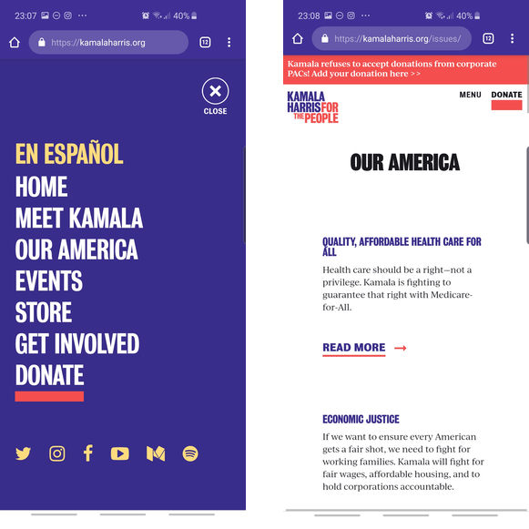
Clicking on the issues, the next page is a high level summary of the problem with Harris’ vision of how to solve it. On some issues (e.g. raising teacher pay and action on gun violence), there’s a link to a much more detailed article that cites facts and figures. To be honest, this is the level of detail I was expecting on Warren’s website, not Harris’. For anyone who really wants to get into how Harris wants to solve these issues, these are very concrete plans. Of course, passing legislation as president would be difficult if you can’t get Congress on board, but that discussion is for another day.
The Verdict: Kamala Harris’ website doesn’t feel as sophisticated as Elizabeth Warren or Bernie Sanders’ sites, but it still feels modern and up-to-date. Much like Warren’s website, I quite liked the color scheme and the fonts. Harris uses serif fonts with long text, which I find is a bit easier to read when dealing with long text. I also appreciated the personal touch with the Spotify account and the amount of detail some of her policy proposals have. The CTAs are somewhat distracting, but less so than Warren’s.
On Point Personal Branding:
Pete Buttigieg
When I searched for Pete Buttigieg’s website, the first thing that struck me is that it’s the first hit, not his Wikipedia page or Twitter account. I wasn’t exactly sure why, but I suspected it might be because being the mayor of South Bend, Indiana, he’s lesser known than any of the four other candidates above. My other thought was that he’s the only millennial in the group and may actually have a really good team of people who understand SEO.
My first impression is that the website color scheme is reminiscent of universities in the US, specifically Notre Dame, or of the US Navy. Interestingly, both Notre Dame and the US Navy are relevant to Buttigieg’s story—his parents were professors at Notre Dame and he served in the US Navy. Nice work if this was the intent, though I’m unsure if a voter who isn’t familiar with his story would get this. To be fair, my other thought was that the colors reminded me of Ravenclaw House, but alas, Buttigieg’s husband mentioned he took the official Pottermore quiz and is a Hufflepuff.
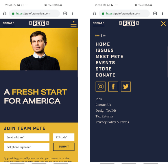
In addition to the color scheme, the hamburger menu is two lines and a star, which looks like Navy insignia. Again, bringing his service to the forefront is a smart design choice, especially considering he is one of two candidates to have served.
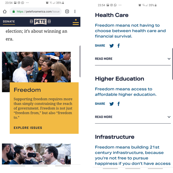
Finding information on Buttigieg’s site is straightforward in the navigation menu, but becomes confusing on the actual page. There is a top level categorization of issues: Freedom, Security, Democracy. But where would I find something on climate change? Turns out it’s under security, which makes sense when I really thought about it, but unfortunately is not obvious at first glance. Similar to Harris’ site, Buttigieg has some detailed plans that you can find after digging a bit, specifically on racial justice and organized labor. It’s all helpful information, though not the best organized.
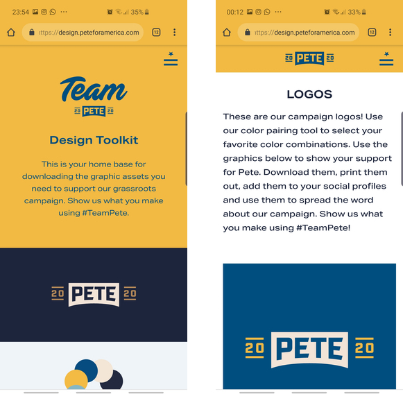
Lastly, one particular aspect I absolutely loved about Buttigieg’s site is the design toolkit. It’s linked in the navigation menu and is on a subdomain, but it has all of the assets you could possibly need to create a Buttigieg-branded grassroots campaign. It has the color scheme, the typeface (turns out they use Aktiv Grotesk Extended, Industry, and Domaine Text), and logos, even ones for LGBTQ Pride (he is the first openly gay person running for president).
The Verdict: Pete Buttigieg’s website is thoughtfully designed to reflect who he is—a US Navy veteran from South Bend, Indiana. Considering that he is 17 years younger than his next rival closest in age in this list (Kamala Harris), his site looks and feels like it. It definitely sets him apart from the others, especially when you compare his site to Joe Biden’s. It feels like a whole package and the choices appear thought out.
So What Does It All Mean?
I don’t think campaign website usability and design ever helped win an election or tilted it in someone’s favor, but it does serve its purpose (here’s another case about hideous email design in campaign emails) and says something about each candidate.
Doing this exercise made me realize a few things I wouldn’t have thought about previously. First, I don’t think Joe Biden is ready to lead if he can’t handle some trolls on the campaign trail. The internet plays a massive role in our democracy today and it would be ignorant to choose someone who is unprepared to deal with that reality. Second, integrating a CTA on a campaign website so that it’s not distracting is hard, especially since the Democrats are now priding themselves on grassroots campaigns. Third, I believe each candidate’s approach to their own website reflects the types of people they’re surrounding themselves with. Bernie has a lot of younger supporters that get his message and combined a classic political website (like Biden’s) with elements that feel more familiar to a younger crowd. Harris is making herself relatable with her link to other media that the other candidates don’t have.
To be fair, it’s still very early in the election season and the first primary votes won’t happen until February 2020. It’s likely that the number of candidates will drop, but I’m betting that these five candidates will be in it for a little longer. We’ll see how their performances are during the coming debates.

